
prettythickcardboardbox.tumblr.com
Wednesday, 7 October 2009
Saturday, 16 May 2009
final piece part 3
This is the last piece in my set of 3 for the exhibition. As I mentioned below, it is one of the final scenes in the book where the evil wizard is turned into an old man and encased in a bubble.

final piece number 2
This is the second illustration for my final piece, this time my scanner seems to have behaved itself. This is from another key scene in the book.

bubbles
This is the third image for my final piece, a key point at the end of the story where the evil wizard "Bardel" gets turned into an old man and put in a bubble which floats high into the sky, whilst the prince and princess are getting married. To be honest I think the image below could be better as it is hard to distinguish the wedding without reading the story, but this piece would accompany the book anyway.

Friday, 15 May 2009
eagles and stuff
This is the second image which I shall be filling with watercolours. It shows "Wendy" the unicorn and "Silas" the wizard casting magic on the evil wizard "Bardel" who is currently in the form of an eagle, who is chasing their ship.

unicorns
This is the first of the illustrations I am doing for my final piece, which shall be a set of three key points taken from the story. I have decided that fewer colourful illustrations would be preferable to more black and white ones, as my research shows this is more common in children's books. Children find coloured images preferable (I put this question to my friend's sister and brother and received a definite answer), and I also believe that they would be more interesting aesthetically for my final piece. A set of watercolour images would also be easier to recognise as children's illustration in an exhibition.
When I scanned in the image, I found that it distorted the colours somewhat. Below is the original scanned image; the light tones of pink and orangey reds seem to have completely disappeared.
 I altered the colours on Photoshop a little to try to get the image as close to the real thing as possible. The image below shows this.
 Whilst messing with this, I increased the blue tones to end with the image below. I actually find this image preferable to my original painting as I think it is somewhat more mysterious and depicts the 'blue light' from which the unicorn appears far better. It also makes the light seem to reflect off of the trees in the background.
 If it was possible to submit the images for printing digitally, I think I would choose the bottom image.
Thursday, 14 May 2009
final piece
I wish! This is the ink outline of the image which I shall fill using watercolours. I got slightly distracted and started drawing a brain and found that it fitted perfectly above the ray of light..

Wednesday, 13 May 2009
toucan/birdy
After completely going through the first part of the story, I learnt that Wendy the unicorn can change forms at her will, and for most of the story takes the form of a "toucan like bird but with a smaller beak". So, here's a toucan with a smaller beak.

I will be moving on to colour next.
Tuesday, 12 May 2009
zines and nice things
I have been searching for types of illustrations for different purposes to see how the styles vary between topic, and have taken a liking to zines and zine culture. Over the summer I am going to make my own simple zine using pens, pencils and a photocopier. After experimenting with Quark at the start of the year, I have decided that it is far too complicated for little projects where overall quality is not immensely important. I might even use publisher.
I have found several websites which concentrate on zine culture, the first being wemakezines which is a networking site similar to facebook or myspace but purely for people interested in making zines. They even stress how they are not interested in people's social lives or interests, and simply want to use the site to compare, swap and take ideas for zines. They also arrange events, including a zine making day for 13 - 19 year olds which took place in September last year at Leeds library.
Friday, 8 May 2009
famous children's illustrators
I have been looking through some of my favourite children's books to gain inspiration for my project. The books which stand out as my favourites from when I was young are those by Roald Dahl, Dr. Seuss and Beatrix Potter, especially as I'm from the Lake District where Potter lived and used to visit the "Beatrix Potter Attraction" in Bowness-upon-Windermere quite often as a child. These books are all beautifully illustrated and really brought the stories to life.
 The Big Friendly Giant from Roald Dahl's "BFG" above, and "George's Marvellous Medicine" below.
 "The Fox In Socks" below.
brian chippendale
This is from a book by Brian Chippendale, who was part of something similar to ‘Tacheles’ (an art collective in Berlin, situated in an old building with separate studio spaces which is also free for the public to look around) but in America called ‘Fort Thunder’ which was a collective of artists and musicians as he is also a member of the band "Lightning Bolt".
 This is the front cover from his book "Ninja".

Chippendales work is mostly in black and white, only using colour for the covers.
Thursday, 7 May 2009
ivor cutler
Ivor Cutler was a Scottish poet, humorist and songwriter who was born in 1923 and died recently in 2006. He was featured on many radio shows as well as live performances of his poetry, some of which solo and some including backing accompaniments. Cutler also published several books of his work, including illustrations of some of the characters in his poetry, the ones below being part of his unpublished bestiary circa 1966-71, created right on the eve of his first published book.
 I find Cutler's style of illustration charming, as despite looking very childish, they are obviously very well thought out. As well as their accompanying poetry they are quite bizarre.
Monday, 4 May 2009
unicorn
I am practicing drawing unicorns as it is one of the main characters in the story. I found a picture of a horse and stuck a horn on it. The drawing looked ok on paper, but after scanning it it looks shit. This has annoyed me very much.

old drawings/sketchbook
I've decided that I am no longer going to use a sketchbook to present my work for this project, as I have come across the main problem which slowed me down in the past. I find it extremely different to start new pages as I am quite a perfectionist and spend far to long trying to make them look pretty and keep the pages running by using fancy backgrounds etc. This is taking me far too much time, and is stopping me from getting on with sketching and practicing drawing, as well as research. Instead, I shall continue to draw in my sketchbook but I shall scan them in and present them on my blog as it is much quicker.
Whilst looking for a blank page in one of my old doodling sketchbooks I came across a page full of scribbles which I had done before I started college and actually enjoyed doing my own strange work. I have cropped this page as it is not completely finished and this is possibly my favourite part.

Saturday, 2 May 2009
toastycats
I recently spent a week up in Glasgow, in which I visited a couple of exhibitions at the Glasgow School of Art and also at the CCA. I shall explain about the exhibition at the CCA in a later post.
 In the small bookshop in the gallery, I found the first and second issues of a small zine called "Toastycats". Each one has 20 pages and is printed on thin paper, A5 in size. I bought the second issue as there was two of these and James bought the only first one. As with Fufurious, it is only the cover which is printed in colour, with the illustrations inside in black and white.
 I really like this zine as Magda Boreysza, the author, has used many different styles of illustration which I find very inspirational. Over the summer I think I will try my hand at making a couple of zines, especially as I find it easier to draw when I don't have a deadline or a set topic.
 Most of the illustrations are very cartoon like, except the story in the last few pages which is more realistic. I really like the style and shall apply a similar one to some drawings for Roy's book to see what they turn out like. Obviously they wont be as good as these.
kaugummi books
Whilst randomly searching on Google for he word kaugummi, I discovered an company who distribute books and zines made by multiple authors. As at the moment I am researching different styles of drawing I found this site extremely useful. Below is an image from the first issue of the Kaugummi collective drawing magazine, it particularly attracted my interest with the image on the right. An interesting concept which could be quite gruesome is drawn in a very childlike manner.

fufurious
In The Easter holidays, I spent a week in Berlin with friends to see the sights, go out in the evenings, and look at architecture and art galleries. Just out of the city centre we found a small French book shop, in which I found this small comic called Fufurious. It is aimed at on older audience as the main plot follows a bear "Grisou" and his heroin addiction. It also features the Beatles and Betty Boop ("Botty Glup") in a slightly twisted and almost unrecognisable form.

I bought this because I like the carefree style of illustration as well as the plot line, stuck inside the front cover there is also a colourful print of Betty Boop and Grisou which is very appealing. Below is the back cover showing the characters of the book, this is the only part in colour as the inside is all black and white.
 Below is an example of what the inside looks like. Unfortunately opened out the magazine is about 2 cm too large for my scanner so a tiny part is cut off around the edges. The style is very rough and uses two thicknesses of line to define some of the characters from the background. I love the handwriting as it is very gracefully done, but saying that I love the French style of handwriting anyway.

Below is an example of what the inside looks like. Unfortunately opened out the magazine is about 2 cm too large for my scanner so a tiny part is cut off around the edges. The style is very rough and uses two thicknesses of line to define some of the characters from the background. I love the handwriting as it is very gracefully done, but saying that I love the French style of handwriting anyway.
Friday, 1 May 2009
ink
Even though I am ridiculously poor at the moment, I spent the last of my money on a pen and ink to try out a new style of illustration. These are just me messing around, and I am currently practicing drawing unicorns as I realised I'm not very good at drawing horsey creatures. Just some dinosaurs which came out of some scribbles, they are joined together like those little people you cut out of paper that hold hands.

Saturday, 25 April 2009
new project
It's taken me a while to get this started (I haven't really been about for long enough to put stuff up, I'll put up my Berlin photos on my other blog when I've got them processed). My major project is based around illustration and that of a book which is yet to be published.
Context
Roy Muir is a published children's author who currently resides in Cumbria. After finishing his most recent children's book, he has contacted me through a mutual friend and has asked me to illustrate his story. I graciously accepted the offer in belief that it would be a short children's book requiring only several detailed images as this is what I was told at the time. I was told that it would be a short story for children around the age of six/seven (the contact I had was through a mature student who I had studied with for my Art Foundation).
After receiving the script I discovered that in fact it is an extremely long story, comprising of 3 parts of 2000 words so far, with apparently more to come, and it seems to be aimed at a slightly older audience than I was earlier informed. After questioning Roy I have managed to come to little conclusion about his requirements for the illustration other than they must be A5 size; I received no straight answer about whether they should be in colour or monochrome (which I think is pretty important as if the book is printed in black and white then rendering the illustrations would be extremely time wasting), and also the number of illustrations needed (one at the start of every chapter, only at important parts of the story etc.).
Brief
Instead of simply illustrating the story as I believe that it should be done, as this could be a very great risk due to the length if I completely misjudge Roy's requirements then it would be a lot of wasted effort and time to restart, I shall put forward a proposal to him showing how I believe that the story should be illustrated. Depending on how this is then accepted, I shall adapt the style in which it is then illustrated for publication.
Thursday, 12 February 2009
evaluation
Well this project has been a bit unusual, in a way in which it doesn't feel complete because I don't have a solid final piece to show. What I've ended up with is a great selection of photographs, and £10 down. I think that it has been successful in a way in which I have learnt a lot from different types of technology, trying out new equipment and assessing its advantages and disadvantages of each, and when it will be useful to me in the future. I have also got to grips with programmes such as Flickr and geo-tagging which I shall now continue to use.
In this project I have explored different types of photography and cameras, different types of film and processing, and how these can then be published for everyone to see. I have come to the conclusion that even though I have had different problems with each type of camera, these can be overcome and all used to the advantage. Even if this may be using certain types of cameras in different light, and which type of camera I would use to achieve a certain effect or purpose.
I definitely could have improved my research with a wider range of cameras and processing, but issues such as money and acquiring types of film have held me back somewhat. With more time and money, and hopefully in the future, I shall continue to experiment with new types of technology such as PDAs and the interactive software available for these. I would also like to explore older technology such as my 127 film camera, as well as large format cameras which I am now aware are available to loan from college. I feel that this would widen my knowledge in the area of photography which is of an interest to me.
web 2.0
As I use it a lot, thought I'd put a bit about web 2.0, "participatory Web" according to Bart Decrem, in comparison to web 1.0, "Web as information source".
Web 2.0 is the term used to cover the new type of websites coming back after the dot-com bubble in 2001, sites which can be interacted with by the user, in which they can control a certain aspect to as if it was their own rather than those which simply provide information. Web 2.0 sites can often also be accessed by the user offline.
Sites which I use which are considered web 2.0 are Flickr, social networking sites such as Myspace and Facebook, and applications such as Google Maps and Earth. There obviously many thousands more available on the internet as it grows but there's no point writing a list. Web 2.0 is important to my project as it shows the constant advancements in the use of internet technology, even though there is a little controversy about whether this advancement is really as big as it's being made out to be.
Well heres a MASSIVE LIST of web 2.0 sites which are currently available, and I'm sure it's growing fair fast.
video
Thought I should write about this, as it's a different kind of technology we've been messing around with, but unfortunately I have nothing to show for it.
A couple of weeks back we were exploring narrative alongside the use of video. This involved us creating a storyboard of a short piece of action we could film in an hour or so in or around college. After deciding on what to do in groups, we were then given the task of re-drawing the storyboard each using a different camera angle; extreme, long shot or close up. We then muddled these up to attempt to make an interesting piece of video. Me, Vic and Jon decided that for ours we would film climbing a tree and cartwheeling around it, as it was relatively simple and we could get squeeze lots of interesting camera angles into it (such as helmet-cam which was going to be amazing). Unfortunately Jon was ill on the day of filming so we had Anna as a super replacement. As Jon was meant to be bringing the equipment for helmet-cam, unfortunately we had to miss out on this, and we had to pretty much re-write our storyboard whilst everyone else had started filming.
Fortunately it was a success and we did some dead good tree scaling, managing to walk to Hyde Park, find a suitable tree, climb it, film it, cartwheel round it, and walk back in 30 minutes dead on time.
The rest of the afternoon involved swapping video footage with another group and editing it to show the whole class at the end. We edited Katy, Nicola and Laura's group of them doing a dance round college. Unfortunately I have no idea where it is saved and who's memory stick it might be saved on, and same goes for the video we made and someone else edited :(
photographiee
Some of the photographs we took in the studio today. We messed around with shutter speeds and flashes to create different effects. My favourite is probably the group photo below, which was created using a slow shutter speed, ISO 100, and err I can't remember the aperture. Relatively small I think. We used a honeycomb on the flash to direct the light, which was then fired several times whilst being moved around when the shutter was open. We also had blue light pens to create the light trails.
 Below was made by firing the flash several times whilst the shutter was still open, as I flapped my arms.
 This was also a long exposure, firing the flash once at the start, then drawing light trails with the blue light in the dark.
 We tried our hardest to make our background look white as it was a bit grubby. This was actually one of the first shots when we were just messing around.
 Same as the square, firing the flash once then drawing in the air with the blue light pen.
 Overall, I had a pretty good day.
photomaphy induction
We had our DLSR induction today in the Photography department in college. I was kind of expecting to be given a camera, talked through it and then told to spend the rest of the day out in town taking photos, which thankfully wasn't the case. We were first talked through the basic functions of the camera, the benefits and negative aspects of each auto function and when we could use each and the reasons for this, such as how different settings use different set apertures etc. After being talked through these we were given 20 minutes to try and use each different auto setting in and around the college. Mine are below..
Macro.. coffee stirrers in the cafe.
 Landscape.. views from the viscom balcony
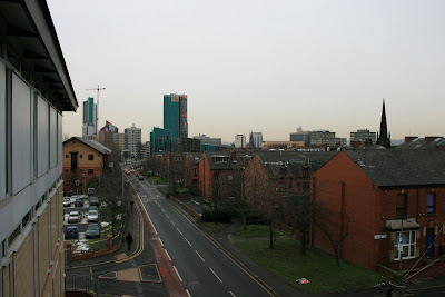
 Normal auto.. horrible flavoured water in the cafe.
 Macro.. stunning close up of Rossitron's face.
 Sports.. Tasha and Vic jumping down the stairs.

I think this induction was actually very useful, as it has helped my to understand how to use the settings on my own DSLR a little more. Unfortunately we didn't touch very much on the manual settings except for how to set it up for use with the flashes. I definitely want to use the photography studios again, especially to play around with the infinity curve, even though I'm not sure what I could actually use it for at the moment other than messing around.
Also, in line with my comm tech project, this has helped to point out some of the advantages to using a digital camera. The obvious such as how it is possible to delete rubbish photos instead of wasting money on getting them printed (when they don't even give you the photos anyway), and the availability of so many different settings. On my two 35mm film cameras, there are no settings whatsoever, so the photographer has next to no control over what the image comes out like, whereas when using the DSLR the photographer is presented with a wide range of possibilities, numerous settings to help achieve a successful image. As the image is also instantly viewable on the screen, if there are any lighting issues for example, it is possible for the photographer to rectify these before taking another photograph, unlike when using film when it can often be a bit of a gamble for the non-expert.
Wednesday, 11 February 2009
narrative
In college we had to do some work which would be the starting point for us to look at different types of technology. Apparently everyone's work was shit so we had to do it again (oh yes, bitter about this), but we barely had any time and they didn't warn us that the bluetooth takes ages. A shambles, completely.
But whatever, this is what we came up with second attempt. Basically to come up with the storyline we played a large scale game of Chinese whispers, in which groups came up with an extra line to add to the story which we would then illustrate using photos from phone cameras(ha!). We are all tremendously immature, and so the story involved four eyed sausages, Michael Jackson, Mike and death (bearing in mind we had no idea about the phone camera bit at this point), which was fairly amusing. Our table spent this wasted half hour playing heads, bodies, legs which I shall publish when I get the chance, otherwise they are here.
When we had to remake our photo narratives, we jumbled up the storyline a little to make it more interesting and added some new parts in. The result:
1. A delicious vegan sausage on a plate, piping hot and mm mm yummy.

2. The strange boy is most excited about eating his sausage, but all of a sudden..

3. The lights go off!


4. ... and the sausage is gone!


5. Obviously, the boy is inconsolable at the loss.


6. In his despair he notices that the window is wide open


7. ... and there is a smug ol' bird with his sausage in its beak.


8. So he takes his pistol with 'victory' already inscribed by the barrel.


9. BLOOD!


10. Tasty bird for tea.


The end.
I'm not sure what we are meant to have learnt from doing this.
Subscribe to:
Posts (Atom)
